
ROCK IN RIO REBRAND
Rock in Rio is a music festival that has evolved from a sole rock concert in the eighties to a worldwide series of festivals across the globe. Now, it not only provides an experience for music and entertainment, but a safe space for communities to join together in one place.
For this project, we were asked by two clients at R/GA to produce a rebrand for this iconic festival. We were asked to center our rebrand around three core needs:
Speaks to a younger audience of 25-30 years old
A flexible system that can vary across genres and
future collaborationConsistency from real life to social media
Along with Morgan Portillo, Dakotah Myers, Saba Saadatdar, Spencer Wilcox, and Kash Thomas, we set out to create a rebrand that can continue to adapt and expand even farther than it already has.

COLOR
The color palette consists of multiple colors that align with stages and other locations within Rock in Rio. This is utilized to make wayfinding easier to understand and navigate around with such large venues. The stage names–Plaza, Avenue, and Underground–correlate to their respective colors on the left, and will never be placed with near different color to avoid confusion.
TYPOGRAPHY
The main typeface used for the logotype is Poppins set in an offset, black frame; this both creates boldness and visual intrigue for the viewer.


LOGO
The logo leans into the idea of adaptability of Rock in Rio. The changing counters reflect genres of music and other facets of entertainment such as pop, rock, metal, sustainability, and more. These reinforce Rock in Rio’s growth, adaptability, and breadth of opportunities provided.


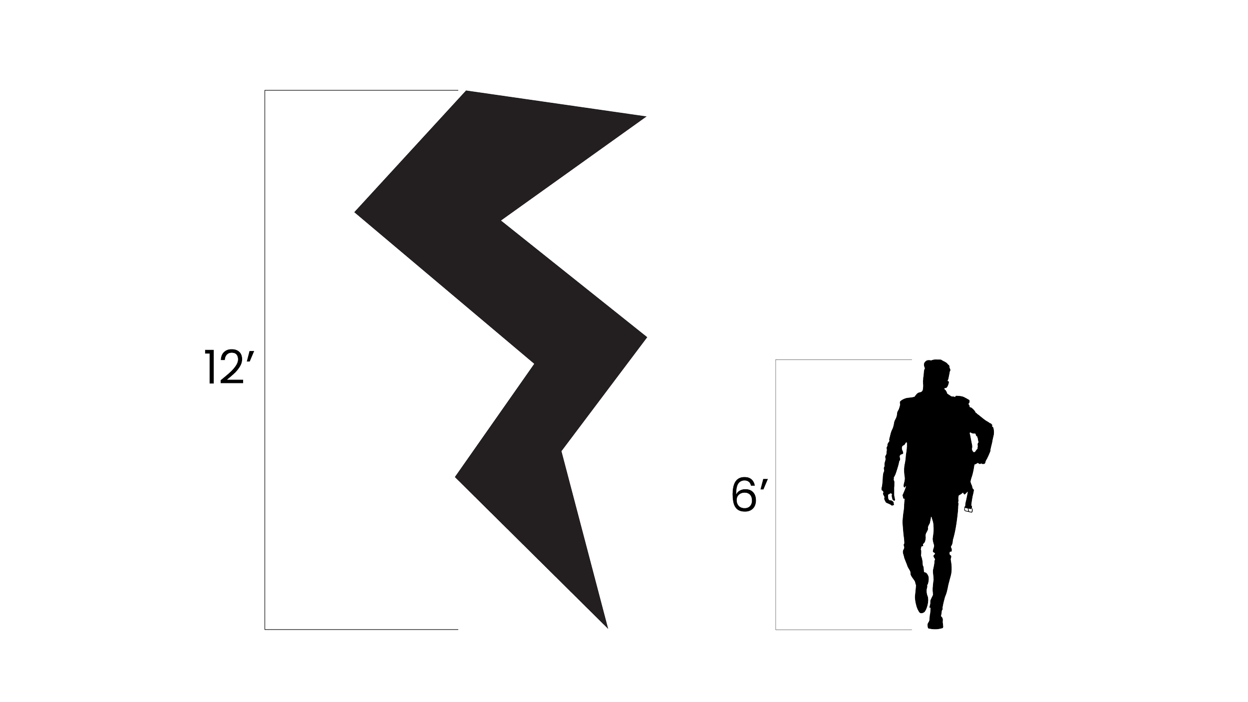
WAYFINDING
The wayfinding signage throughout the venue continues to build off of the system of color and symbols at a large scale. These sculptures are monumental and provide directions for important places, but also act as easy to find meeting places for groups of people.


ECO INITIATIVES
Rock in Rio has gone to great lengths to encourage sustainability and environmental programs including a 100% zero waste goal achievement at Lisboa and partnerships with organizations to rebuild the Amazon rainforest for the Amazonia Live project.
We pitched a concept that incorporated screen printing into merch stands. In order to enhance sustainability and reduce waste, instead of creating new shirts, festival-goers are encouraged to bring their own to be screen printed on. They can choose from a plethora of screens and patterns for customization while encouraging the reusing of old materials over buying brand new.

APP MOTION
The Rock in Rio app provides a quick, easy, and accessible way to access information about Rock in Rio from a wallet for daily tickets, a customized calendar, and explore pages for artist, genres, and cultures from all around the world.